By: Andy Martinez
Photos By: Jonathan Weingers
Styled By: Ladonna Apodaca
Interior Design By: Brenda Baunach & Linda Powers
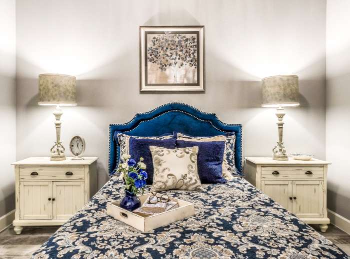
A modern home for those who refuse to forego the sense of nostalgia and feel of a house that feels like one that you would have grown up with, this home evokes the feeling of a family heirloom with the reality of the modern appeal.
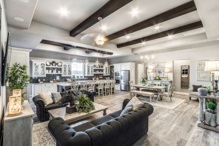
A clear defector of living space separation, this home-style opts for the open and convivial sentiment that people are beginning to regain an appreciation for. While aware of modern-day market trends, this home does not rely on what is ‘’in” as much as it does on what will have longevity with its timeless aesthetic choices. The identity of a home is something that comes to exist when a homeowner moves into and begins to customize the home. Accordingly, Pacifica Homes has created this home template to entice and get the gears turning in the minds of a potential homeowner on just how they can make this home their own.
 This model home’s design pulls from Cape Cod nostalgia after its 1950s resurgence with its multi-paneled windows, bright and relaxed ambiance which follows a serene sensation throughout that you’ll be wondering why you can’t see the lighthouse and splashing waves in the horizon. The home is also tinged with country French design, the decorative exposed beams, multi-level ceilings and ornate kitchen storage rejects contemporary minimalism while still appearing clean and un-busy. This home blends these two eras and regions so well that you’ll always want to have a baguette laying out on the kitchen counter, to dip into the clam chowder with, of course.
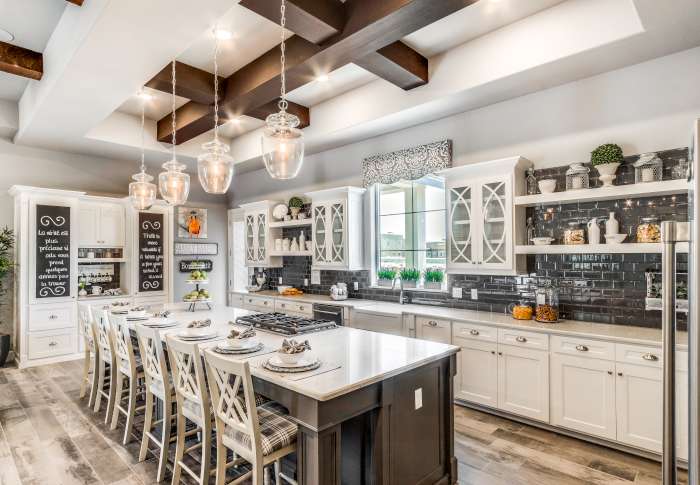
The kitchen, seemingly set up for an in-home online cooking show, serves perfectly for entertaining friends and family. The cooktop facing directly onto the rest of the living area allows for direct communication, or for showing off some fancy cooking skills to a live studio audience. With ample counter and walking space, making dinner a family project doesn’t seem like such a daunting idea anymore, as any bumped elbows would be purely the result of those arguing if the stew really needs more salt. The kitchen cabinetry might make you a bit insecure as that wedding gift dishware suddenly doesn’t take up as much space as you originally thought. Regardless, the space exists to make the kitchen set up less disconcerting.
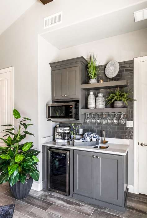
 The home also includes an area which, while not on many people’s home check off list, anyone would be wondering why they never had it before. The area, of course, is a home beverage station. With a modest yet ample wine chiller, space perfect for an espresso machine and a sink that would seemingly reject
anything other than wine glasses.
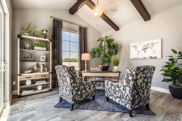
The homespun style of this home is unpretentious and simple, which makes it ideal and easy to grow into. Grab a book and sit comfortably by the tall window in the reading nook, or alternatively, convert it into an in-home office, one that doesn’t feel separate from the home but rather follows the flow of the living area through design and space.
The living room, dining and kitchen all share an open space, but, instead of seeing it as a sacrifice of privacy, it instead takes the separations in the home space and turns it into a place where communication and companionship is encouraged. With interior design by LL Power & Associates, the home takes on an air of safety and of a place where one can truly feel like they are coming home through the use of soft textiles and hearteningly comfortable seating and lounging areas.
The house’s design follows a simple, yet difficult, formula to follow when it comes to putting a home together. Open up the space for people to interact, make everything as comfortable as possible for the homeowners, allow for guests to come in and know that there is space meant for them. This home does it well and is perfect for any homeowner looking for a space that they can see themselves living in for many years to come.